Heritage Rescue – Devonport
I provided the exhibition and design expertise for 3 series /24 episodes. Each episode required major renovation of a small rural Museum or site within a restricted timeframe and budget. Local community members and some of the production team helped pitch in to get to the finish line.
So many different stories, challenges and good times with each unique and fabulous part of New Zealand’s extraordinary landscape and people. I really was able to hone my skills with this series as each project always required a specific and distinctive response on the turn of a dime.
Devonport Museum
The church architecture was painted mainly in shades of white. There were areas that had been painted piecemeal with tones of blues and deep purple.
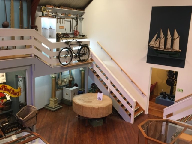
The attractive internal architecture wasn’t immediately apparent mainly due to the clutter and disordered collections inside but also because of the lack of definition using colour.
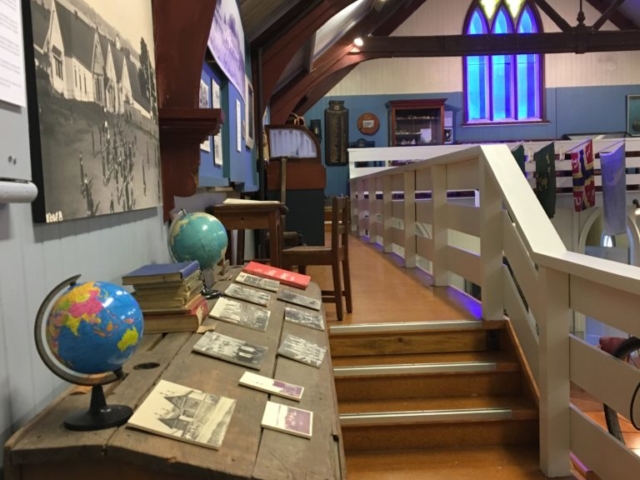
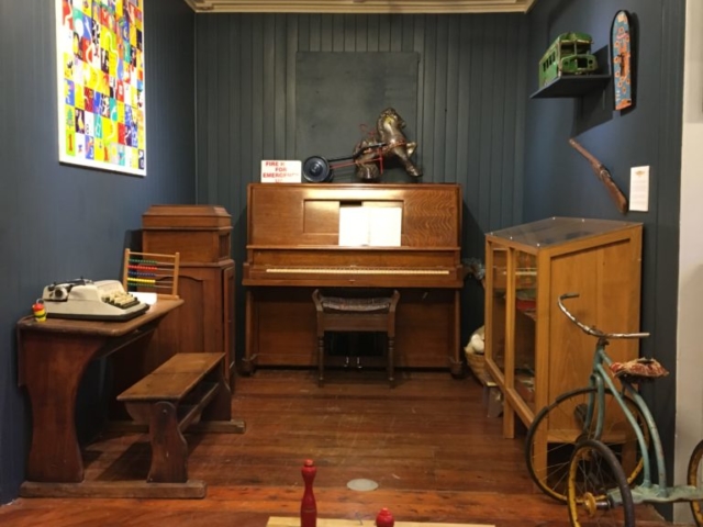
Shades of blue were used to organise the side rooms. Shades of blue were selected to differentiate and add interest in and between the side rooms (upstairs and downstairs) from the central body of the church building. These different shades created perspective and dimension to the space and allow each area to have a different character and feel.
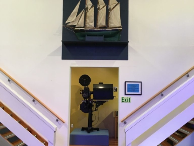
A grand focal tableau using a rich blue backdrop and a large pond yacht was created on the large end wall of the church– this acted to draw the visitor through the church towards the rear providing a path around each of the exhibits.
The grey was used to gently pick out the banisters and columns and this was used to add more subtle architectural interest.
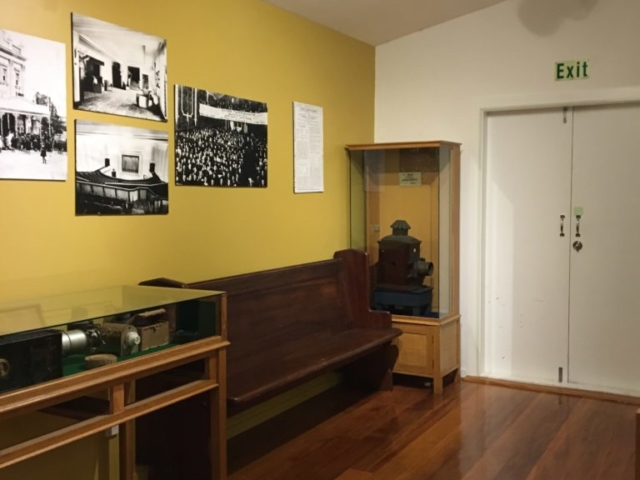
The rich and warm yellow/gold was used in the entry area and end annexe wall- and was a great device to link and connect these two architectural end walls.
All the original wooden central floor cabinets were painted internally with an all-purpose white. Lighting for central floor cabinets was limited and unfocused so a white internal colour enabled the collections to stand out and be more visible and dramatic
Wall cabinets were painted blue to fuse with wall colours and create a unified dramatic effect.
Devonport’s historic maritime foundation, colonial background and rich Maori occupation were all carefully covered as well as its protest against nuclear proliferation were all covered using panel interpretation and inventive display techniques. A large drop banner was used in the entry foyer to provide an immediate uplifting and contemporary visual clue for the visitor. On entry into the museum a large area was used for an immersive timeline to create visitor orientation to Devonport’s substantial past.
