Heritage Rescue – Eketahuna
I provided the exhibition and design expertise for 3 series /24 episodes. Each episode required major renovation of a small rural Museum or site within a restricted timeframe and budget. Local community members and some of the production team helped pitch in to get to the finish line.
So many different stories, challenges and good times with each unique and fabulous part of New Zealand’s extraordinary landscape and people. I really was able to hone my skills with this series as each project always required a specific and distinctive response on the turn of a dime.
Eketahuna / Mellemskov Museum
The connected church hall and school house with its a large high stud environment provided exceptional potential. It however lacked any display / narrative cohesion, with its collections and seemed more like a repository or storage area.
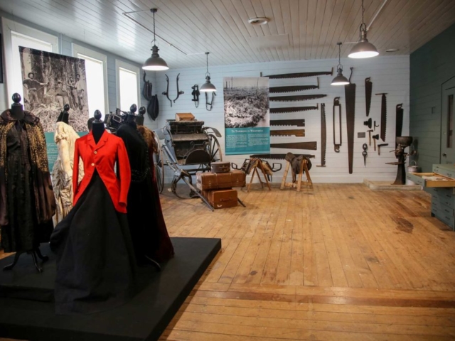
Stripping away the large and unrelated collections from the interior and developing a dramatic and rich colour palette was a way to create theatricality and a sense of drama and structure.
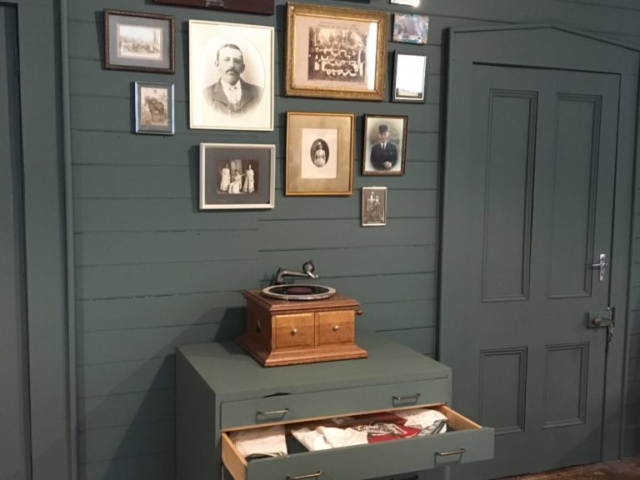
A deep rich green was used on the internal wall to reflect the rich deep colours of the 40 mile bush that once existed in Eketahuna. All the architraves and doors on this wall were also painted green, in this way there was no distraction from the large broad sweep of the wall colour. This wall being so deep and opulent in colour, it created an anchor to the other walls.
The surrounding 3 walls were painted with a soft grey- blue providing some relief to the rich deep green wall and yet retained the rooms drama and sense of theatre. The room colours created an intimate and warm feel within such a large space.
The ceiling hung fluorescents were replaced with black industrial style pendant lighting and this cast warm light against the walls, emphasizing the rooms cocoon like feel.
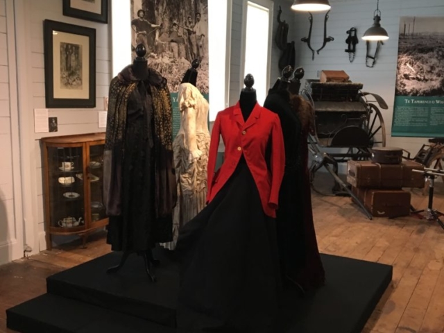
Spot lighting was introduced in the central beam to focus and pick out on the changing textile displays.
The floors remained their original dark brown timber boards and the ceiling was untouched, a painted timber panelled white.
All the windows were covered fully with unbleached calico blinds to reduce harmful direct sunlight reaching the collections.
The original display cases and plan cabinets were painted green. These were all lined with washed black cotton stretched over archival card backings. This provided a dramatic backdrop for the collections on display.
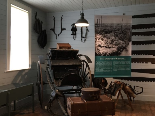
I really went to town with the collections- being able to cover the towns rich forestry and farming story. I also emphasised the Maori history in this region- by displaying donated tekoteko and heke to create a community kura near the entrance. Historic clothing previously donated by local farming families were displayed at the central axis- emphasising this areas once rich and affluent past.
3 large printed banners were used to create distinct but related exhibition storylines. They were hung specifically to divide the floorplan, guide visitor flow throughout the space and provide a narrative.
Simple and effective wayfinding panels were used externally to create a clear directional flow and context for the visitor.


